I led the redesign of DFW’s gate information display system, creating a clear, brand-forward experience that helps passengers find their flights with confidence.

THE FRICTION
Designing a Gate Display System for All Airlines at DFW Airport
Gates D1–D4 sit slightly apart from Terminal D’s main flow, making the displays at the gate even more critical for passengers. Because these gates feel more isolated, passengers rely heavily on the screens for reassurance and direction.
The existing Gate Information Displays looked polished but failed to bring real value. Passengers could not scan flight info fast enough, and the screens felt generic and disconnected from airline brands. This led to more questions at the counter, slower boarding, and added strain on operations.

Building a Multi‑Airline Gate Display Solution for DFW
DFW needed more than a fresh look. They needed a Gate Information System that delivered clarity at a glance and worked for every airline. They brought our team in to lead the redesign, and I focused on defining the information hierarchy and building a flexible framework that could scale across all gate screens.

THE SOLUTION PATH
I turned client feedback into a clear design goal,
then built a system that could scale across all gate displays.

Defining the Real Problem
The project moved fast. Our Team joined midway, which meant there was no time to plan interviews or run on-site studies. Like many other projects, we had to work with what was available.
From the very first conversation, the message was not about colors or fonts. It was about frustration. Passengers could not scan flight details quickly, screens felt generic, and staff were stuck answering questions the displays should have solved.


Pain Points We Heard
Confusion - Flight info wasn’t prioritized or readable at a glance.
Disconnect - Displays did not reinforce airline identity, leaving passengers unsure they were in the right place.
Strain - Gate agents were fielding repetitive questions the screen should have already answered.
What That Meant for the Design Goal
We weren’t just redesigning for a better look. The goal was to create a system passengers could understand instantly, one that made airline branding clear and trustworthy, while staying simple and consistent across every display
Building the Design Foundation
The gate experience at Gate D1-D4 depends on three types of screens: the Gate Information Display (GIDS) that passengers stand right in front of, the Overhead Displays that guide them from a distance, and the Media Wall that frames the entire gate area. The redesign began with the GIDS because it carries the most detailed flight information and establishes the structure that the other screens would build on. Once the GIDS was right, its hierarchy, spacing, and layout could scale outward to the Overhead Displays and Media Wall.
Before designing, the team and I needed to understand what already worked at other terminals. It made sense to study the systems passengers were already seeing elsewhere. That led us to the High‑C GIDS displays, which set the standard for much of what DFW wanted and got many things right for Gates D1–D4.
From there, I took the lead in shaping the design direction and translating those shared insights into sketches, mockups, and ultimately the scalable system that DFW needed.

Learning from High-C
High C became my starting point, not my solution. It was designed for American Airlines only. Every rule assumed AA’s logo, colors, and layout. DFW needed something bigger. They wanted a system that could support every airline now and in the future.
This became a turning point for me. I treated High‑C as a study model, pulling out the best ideas, such as hierarchy, spacing, and tone, and then rebuilding those ideas into a framework that could scale to Delta, Qatar, Emirates, and every airline using the gates.
But to make that framework stronger, I needed to look beyond High‑C and study how other industries handled complex information displays.

Looking Beyond High-C
I needed more than one reference. Gate screens are essentially large information cards, so I explored how other industries handle complex info: transit boards, dashboard UIs, and app cards. Some used bold type for fast scanning, others leaned on subtle layouts for flexibility.
This broader research set the tone for the new system, clarity first, with branding that can flex across every other airline.


Crafting the Core GIDS
I began sketching the core GIDS screen, the display passengers stand in front of at the gate. Every line on paper focused on stripping away clutter and prioritizing what mattered most, testing how flight details could be read in just a glance and understood in seconds.
I created three sketches to explore different layout ideas

Those sketches shaped three principles for the system


Iterating Toward the Solution
I turned the three sketch concepts into mid fidelity mockups and brought them to the solution team for review. Together, we looked at readability from different distances, whether the layouts could adapt to every airline, and if each concept actually solved the issues the client had raised.
After that review, the team and I agreed on the option that delivered the clearest passenger experience while remaining practical to implement.


The chosen option directly addressed the client’s pain points. Flight info was prioritized for instant scanning, airline branding was clear and consistent, and the information flow reduced questions for gate staff.
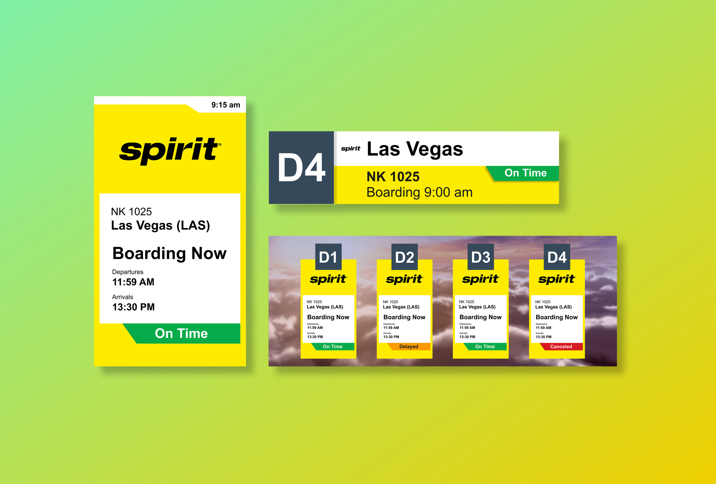
I then swapped in placeholder logos for Air France, Qatar, and Emirates to see how the chosen layout handled different airline identities. This step confirmed the design stayed balanced and functional no matter which brand was applied.

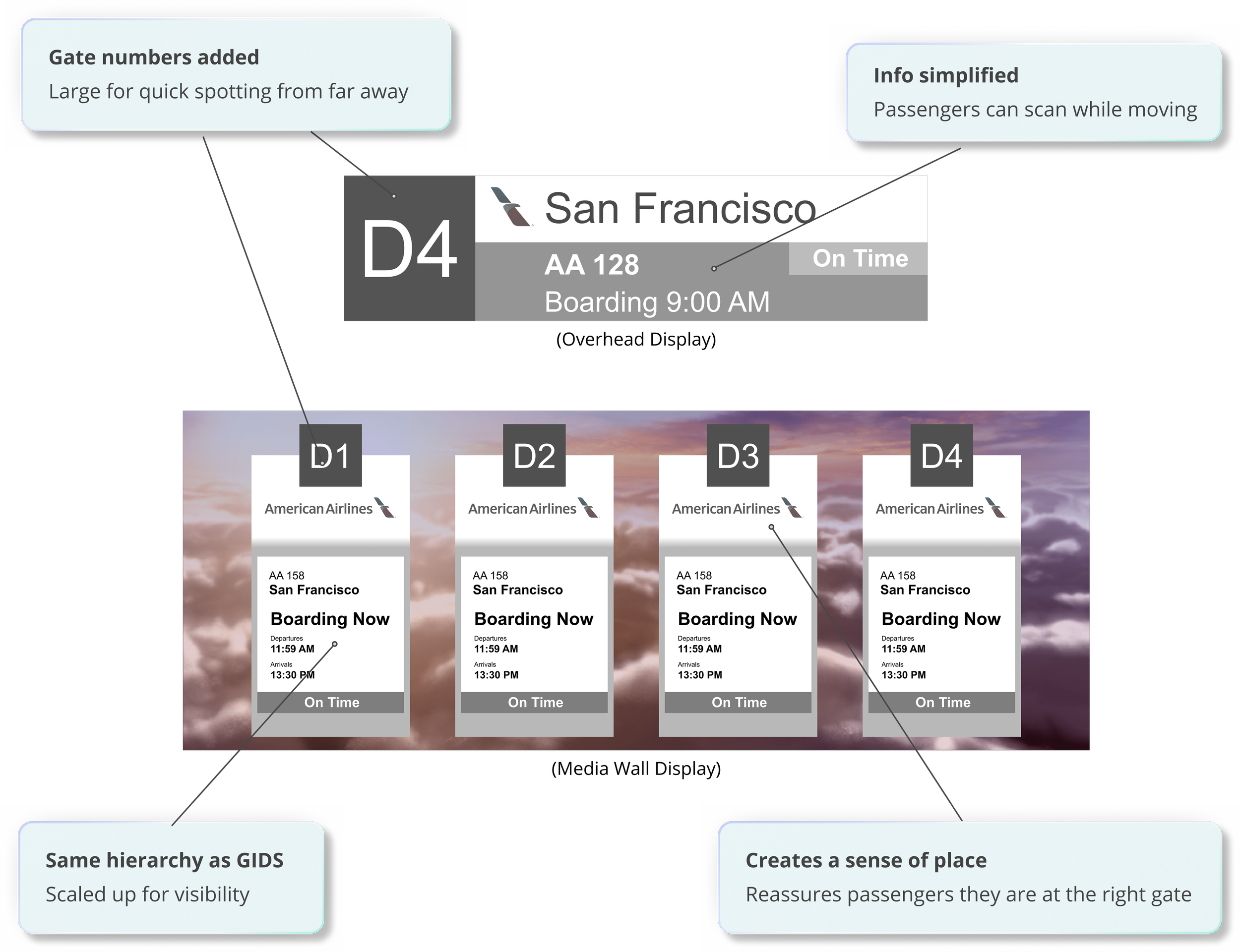
With the GIDS framework set, it was time to bring in the Overhead Displays and Media Wall. Unlike the GIDS, these screens needed their own gate numbers because they serve as orientation markers from a distance. I applied the same hierarchy, spacing, and branding rules to these screens, testing how the system held up at different sizes and distances.
When I brought these mockups back to the team, we reviewed how logos and airline codes fit within the layout, how different flight information lengths are displayed, and whether the framework stayed clear and consistent without relying on color. We also checked text sizes and contrast choices to ensure information would remain readable for all passengers.

With the layouts finalized for the GIDS, Overhead Displays, and Media Wall, the system was ready to move from concept into real-world application, and the results speak for themselves

THE TRANSFORMATION
I designed a system that now delivers clear,
consistent information across every gate display.

Bringing the System to Life
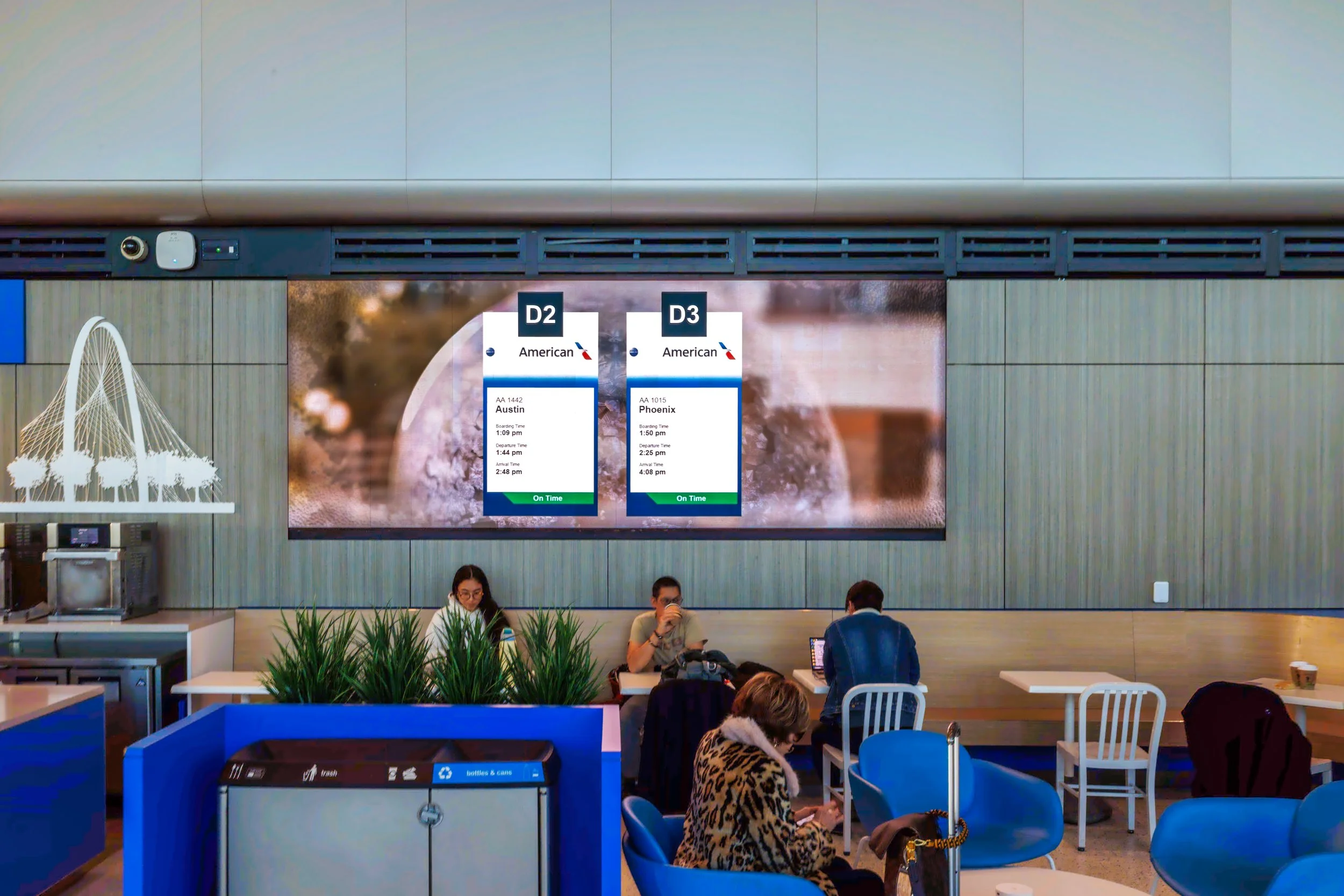
With every detail tested and refined, the system moved from concept to reality, transforming how passengers see and understand flight information at DFW. The Gate Information Display (GIDS), Overhead Displays, and Media Wall now work together as one unified experience, ready to guide passengers at every step.


THE RESULT
The new GIDS system doesn’t just look better,
it improves scanning, builds brand trust, and eases confusion.
Operations Team, DFW Airport
“The new displays make every airline look consistent and professional.”
Implementation Team
“The system is flexible enough to roll out to new airlines with no extra redesign.”

Early feedback and testing showed passengers processed gate information 30% more accurately, boosting confidence and reducing questions for gate agents.


