I led the redesign of DFW’s flight information display system, crafting a more scannable, stress-free experience for 80 million passengers.

THE TASK
Modernizing the Passenger Experience at DFW Airport
DFW’s internal research revealed a recurring problem: passengers struggled to locate the right flight information quickly, especially when navigating crowded terminals, managing tight connections, or dealing with travel stress.
I led the redesign of DFW’s Gate Information Display System (GIDS) with one clear goal: make vital flight details instantly understandable, even under pressure. This project challenged me to rethink how real-time data, user needs, and operational constraints come together, and to design a solution that works in motion, at scale, and in moments that matter.


RESEARCH
I explored what matters most to travelers,
to uncover the information they trust and need most.

Understanding the Problem
DFW’s gate displays needed more than a visual refresh. The legacy design was overloaded, inconsistent, and hard to read, causing missed updates and added stress for passengers. Staff often had to repeat information, increasing operational pressure and showing the need for a clearer traveler experience.
My goal was to design a system that helped passengers absorb key flight details quickly, while supporting DFW’s larger push toward digital clarity and brand consistency.

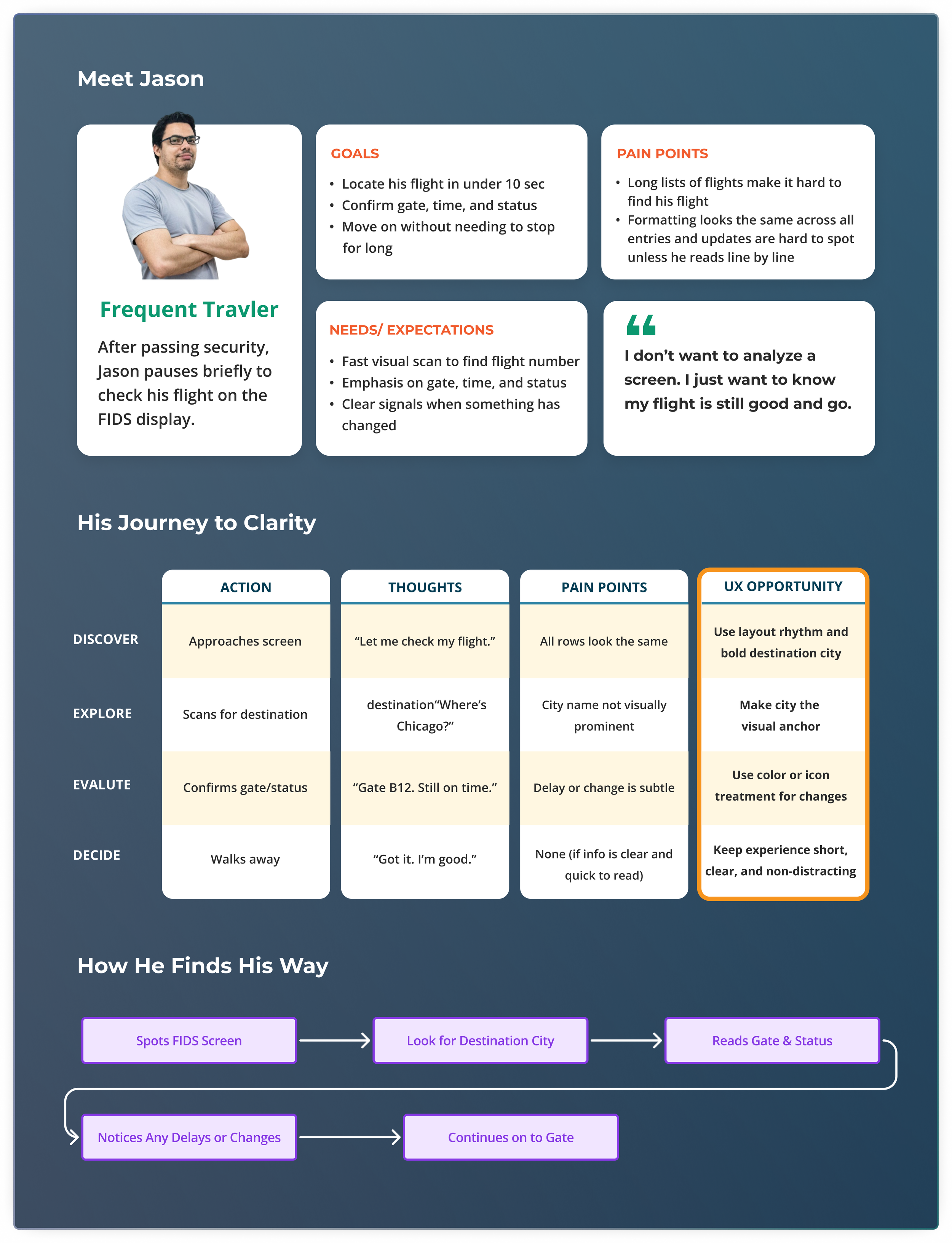
Research: What Matters to Passengers
I started by observing passenger behavior at the gates and speaking with both passengers and operations staff. My focus was on understanding what people needed in the short window between arriving at the gate and boarding.
From these observations, I identified two common flight lookup behaviors:
• Searching by destination city
• Searching by flight number
While both behaviors occurred, I noticed a clear trend. Most passengers were more likely to scan for destination city names first. This insight guided the direction of my persona and user flow, which were shaped around the more common behavior observed in the field.

Before jumping into design, I conducted a visual audit of flight displays at major international airports. My goal was to understand how flight information is typically structured and what patterns passengers are already used to.
What Other Airports Are Doing

Key visual patterns essential for airport environments

At this point, I was still leaning into a traditional table format, believing it would offer familiarity. But this research planted the seed that while common, those patterns might not serve real user needs.
The visual patterns I observed directly informed my initial design goals: quick scanability, clear visibility of delays, user confidence under time pressure, and a sense of visual order that supports the airport environment. With those goals in mind, I started by sketching some traditional table layouts.

DESIGN
I designed for clarity under pressure,
ensuring critical info stands out in motion and at a distance.

Starting With the Expected
I began by sketching a traditional flight table layout based on rows and columns, similar to most airport displays. The assumption was that familiarity would reduce friction and allow passengers to recognize patterns easily.

Exploring Different Lookup Priorities
While research showed most passengers look up flights by destination, we wanted to validate that assumption through design exploration. I created several layout directions, each one focusing on a different user behavior. These variations allowed us to compare how prioritization affected clarity, scan speed, and user confidence.


Internal Testing and Critique
To evaluate the initial tabular layouts, each team member was assigned a flight to find across all three versions. I timed their lookup and captured feedback across four key areas: scan time, clarity, delay and change visibility, and user confidence.

Takeaways and Direction
None of the layouts fully met our usability goals; all felt slow and somewhat unclear under pressure. However, the version that prioritized destination names performed noticeably better in scan speed and confidence than the one starting with flight numbers.
In particular, Version 3’s alert tiles stood out during testing. The visual contrast made delays easier to identify at a glance, even when the overall layout felt dense. That strong visual signal led us to pivot and explore tile-based layouts more deeply in the next round, combining destination-first structure with high-visibility delay indicators.
Pivot to Tiles: Reimagining Flight Display
Based on internal feedback, we shifted focus to tile-based layouts. The goal was to surface urgent information more quickly, reduce scan friction, and create a more modern, branded experience.

Refining the Direction: Testing Tile-Based Layouts
I conducted a second round of internal testing under time pressure. The goal was to identify which tile format best supported fast scanning, visible alerts, and high user confidence.
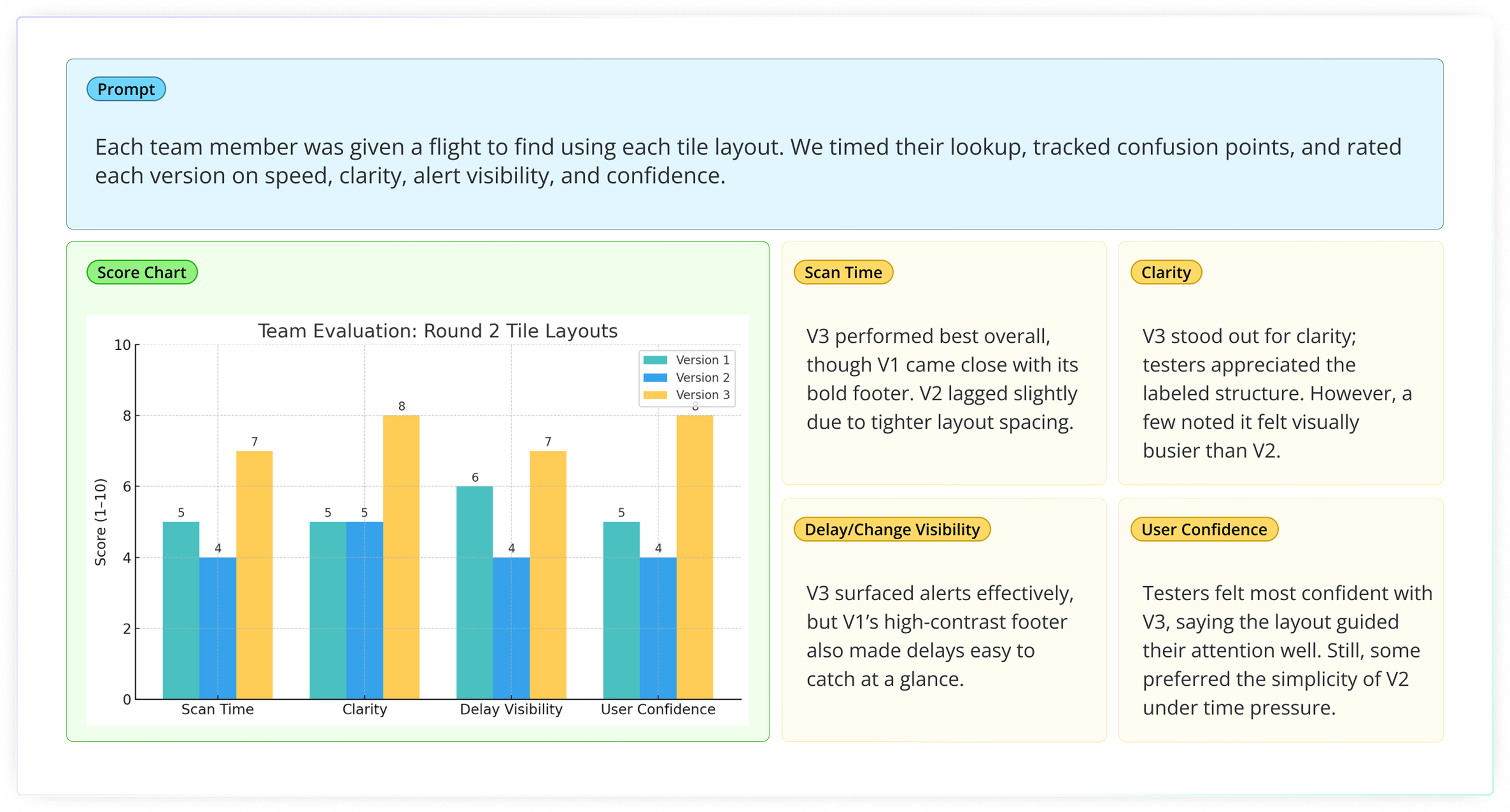
Team Debrief and Next Steps
After reviewing Round 2 results, the team agreed that Tile 3 offered the best foundation. It surfaced key information clearly, built user confidence, and aligned well with modern design expectations. Based on that consensus, I moved forward with refining Tile 3 into a final, production-ready design.


THE RESULT
The design didn’t just look better,
it saved time, eased staff workload, and improved passenger confidence.

Info Desk Staff, DFW Airport
“People used to ask us about gates nonstop. Now they just look up and keep moving, it’s made a big difference.”
A passenger I interviewed
“I didn’t have to scan a giant wall of numbers — I saw my flight, my gate, and my delay right away. It was way less stressful.”